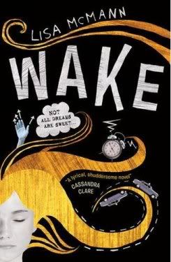
I...don't like it very much....I don't think it reflects the book very well; it's not dark enough. And I don't like the color of the hair. And I don't like the objects thrown in there. I DO really like the font, though. So, yeah, definitely not my favorite cover. But, that's just me. What do you guys think?


It's a nice cover, but even though I haven't read the book yet, I can tell it doesn't fit. I could see it more on something similar to Jenny Valentine's Me, the Missing, and the Dead (kinda reminds me of the UK cover of that).
ReplyDeleteoh, you are right. I don't like this cover at all. In fact, I wouldn't even pick it up at a bookstore. Covers are so important!
ReplyDeleteEek! Definitely seems too fun/quirky for such a dark plot. Prefer the US one 100%. I'm curious to see what UK-ers think.
ReplyDeleteI actually really like the cover.. but I haven't read the book so you may be right about it not being fitting with the story.
ReplyDeleteAllison
Well-Read Reviews
Cooool cover.
ReplyDeleteI'll be honest. I hate this cover. Too much of a cartoon look for me.
ReplyDeleteI haven't read this book but I also don't like this cover, I like the U.S. one much better.
ReplyDeleteI always wonder why they release books with different covers in Europe and in the U.S. In fact when I like the U.S. cover better I've been known to pay more to get a book with the U.S. cover. Kinda crazy I guess but oh well!
Well i can't judge about the book from it's cover.
ReplyDeleteWell, it's kinna creative.
ReplyDeleteKinna unique.
It's not beautiful but it's enough to make people picking it up from the bookshelf.